Radarr Help and Support
Ticket Analysis Dashboard
Table of Contents
The Ticket Analysis Dashboard displays the data based on the tickets created. Navigate to the Ticket Analysis Dashboard in the Response Module
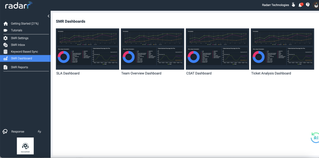
Fig: Ticket Analysis Dashboard
The following charts are available under the Ticket Analysis Dashboard:
- Ticket Analytics
- Volume of Inbox
- Peak Time
- Messages over Time
- Platform Analysis
- Platform Wise Ticket Status
- Share Of Voice By Tags
- Outgoing Messages Analysis
- Early Warning System
- Ticket Analytics
- Ticket Analysis shows status-wise tickets for the selected profiles and filters.
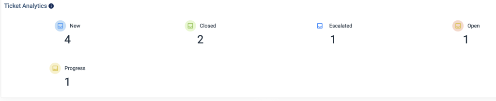
Fig: Ticket Analytics
- Volume of Inbox
- The volume of Inbox shows the number of tickets over time per page for the selected filters and profiles. The chart doesn’t consider the data from agent replies.
- The chart can be downloaded in CSV or PNG format.
- Select the interval as required.
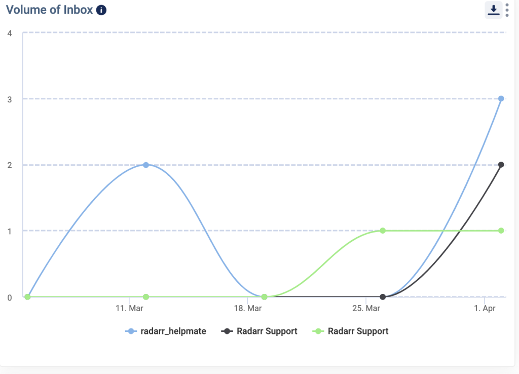
Fig: Volume of Inbox
- Peak Time
- The peak time of the day chart shows a number of tickets per day and per month for the selected filters and profiles.
- The chart doesn’t consider the data from agent replies.
- The chart can be downloaded in CSV or PNG format.
- Select the Chart Type as Day or Month as required to view the data.
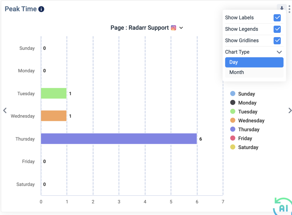
Fig: Peak Time
- Messages over Time
- This chart shows the messages over time. Incoming messages are messages received from your customers and Outgoing messages are messages sent by your customer service agents and include any auto-responses you may have set up.
- The chart can be downloaded in CSV or PNG format.
- Select the Interval as required to view the data
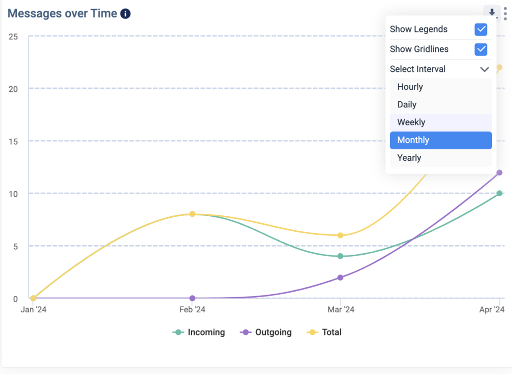
Fig: Message over Time
- Platform Analysis
- Platform analysis shows the breakdown of tickets by platform.
- The chart doesn’t consider the data from agent replies.
- The chart can be downloaded in CSV or PNG format
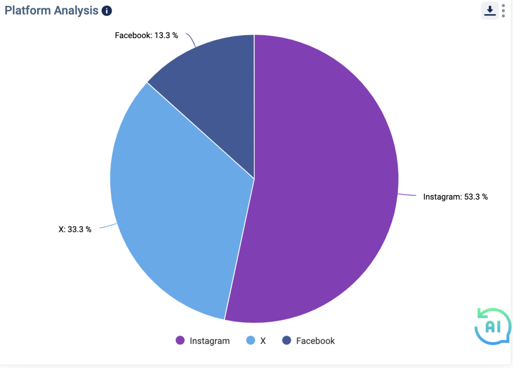
Fig: Platform Analysis
- Platform Wise Ticket Status
- This chart tracks platform-wise split of received tickets to understand the percentage contribution of each platform
- The chart can be downloaded in CSV format
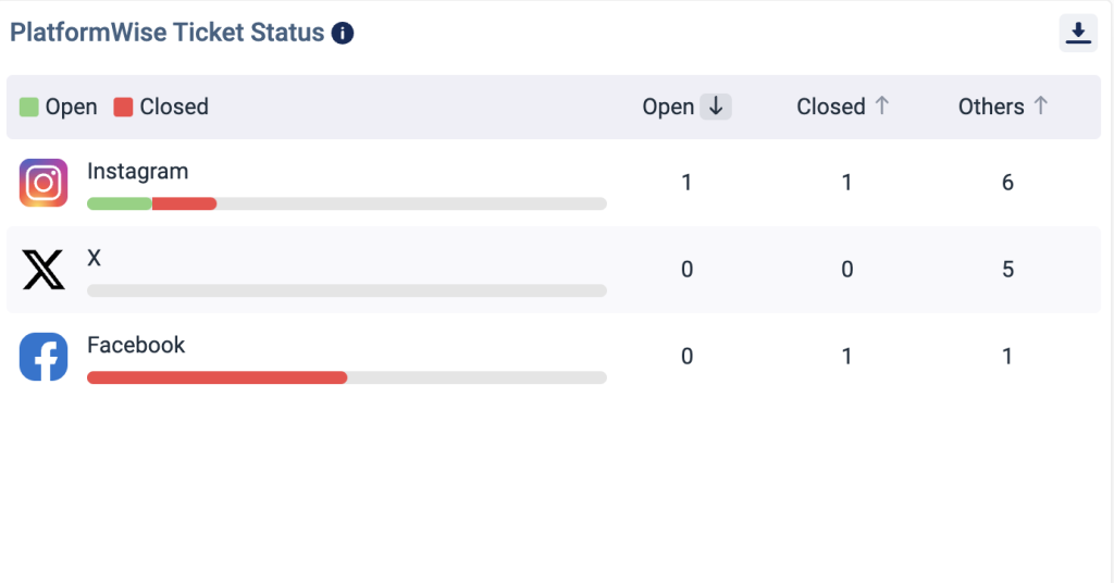
Fig: Platform Wise Ticket Status
- Share Of Voice By Tags
- Share of Voice shows the breakdown of all the tickets based on tags.
- This chart can be downloaded in CSV or PNG format
- This chart can be viewed in different forms like pie chart, linear chart or exponential chart by selecting the icons highlighted in the image below.
Fig: Share of Voice By Tags
- Outgoing Messages Analysis
- This chart shows the distribution of outgoing messages across different channels, including messages generated on the native platform, Radarr manual responses from agents, Salesforce interactions, Automation Engine auto-responses, and auto-responses during non-business hours.
- In this analysis, we will focus on only the duration between the creation and updating of messages, rather than the ticket creation and updating duration.
- This chart can be downloaded in CSV or PNG format
- This chart can be viewed in different forms like pie chart, linear chart or exponential chart by selecting the icons highlighted in the image below.
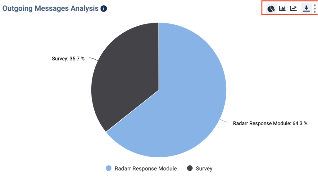
Fig: Outgoing Messages Analysis
- Early Warning System
- This widget shows all tickets that have status New for more than 1 hour.
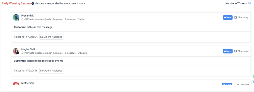
Fig: Early Warning System